
Sector
GovStack
Time
2024-Present
Team
15
Role
Solo UX Designer


While most people think of UX as just screens, this is "Logic-First UX." It’s a technical flow that focuses on the chronological order of interactions between different objects or systems (The Taxpayer, the SFEC system, and the notification gateways).
Why We Did This (The "So What?")
We intentionally used this technical style to create a single source of truth for the entire team. Before I move into my designer-centric User Flows (which focus on the interface and human emotion), we needed to:
Align with Devs & BAs: Ensure the backend logic is technically feasible.
Eliminate Ambiguity: Clear up exactly how "if/else" scenarios are handled so there are no surprises during development.
Build a Solid Foundation: By "breaking" the logic here, we save hours of redesigning screens later.

From System Logic to Human Experience: The User Flow
With the functional requirements and backend logic validated through our Sequence Diagrams, the next phase of the design process was to translate that "machine-level" data into a seamless human experience.
While the previous stage defined what the system does (the "if/then" rules and API triggers), this User Flow section focuses on how the taxpayer actually navigates those rules. Here, I’ve shifted from a technical blueprint to a designer-centric flow to:
Visualize the Interface Journey: Mapping out the specific screens, buttons, and visual cues the user encounters.
Prioritize Frictionless Interaction: Ensuring that complex steps—like multi-factor authentication and password setting—feel intuitive rather than clinical.
Contextualize Feedback: Defining how success messages and error states appear visually to guide the user back on track without needing to understand the underlying code.


From System Logic to Human Experience: The User Flow
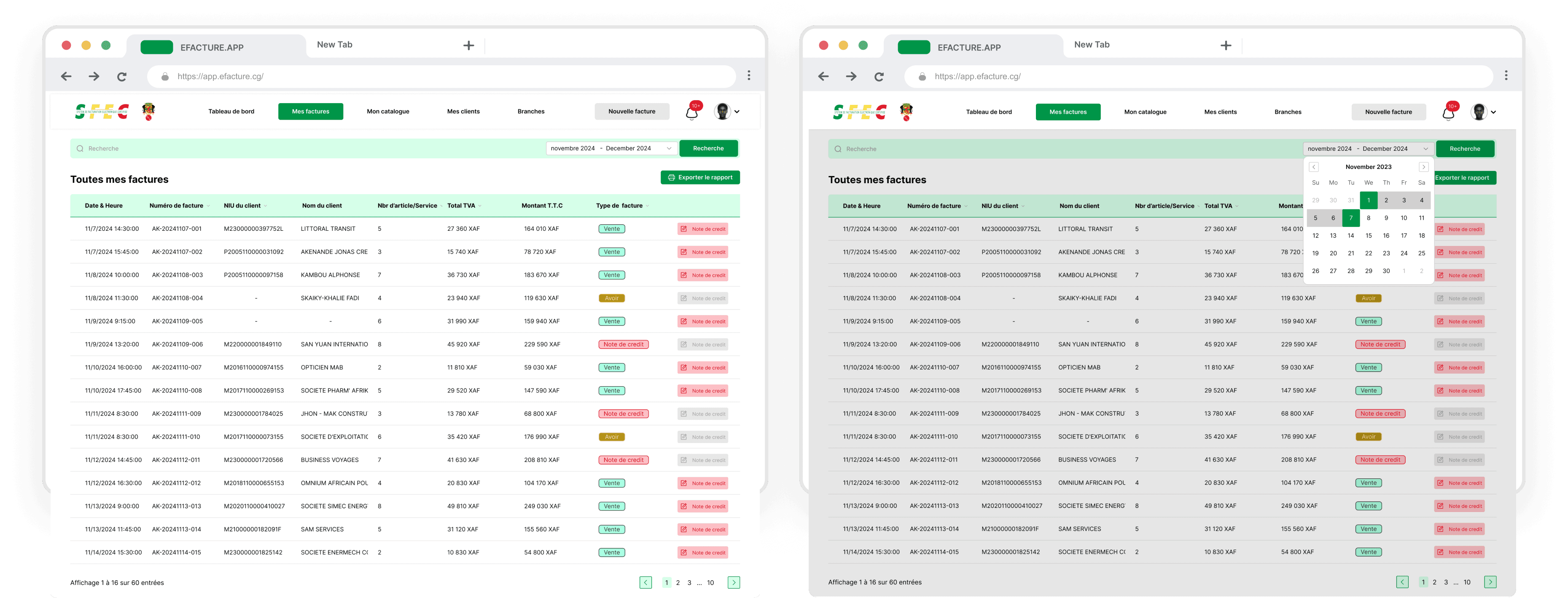
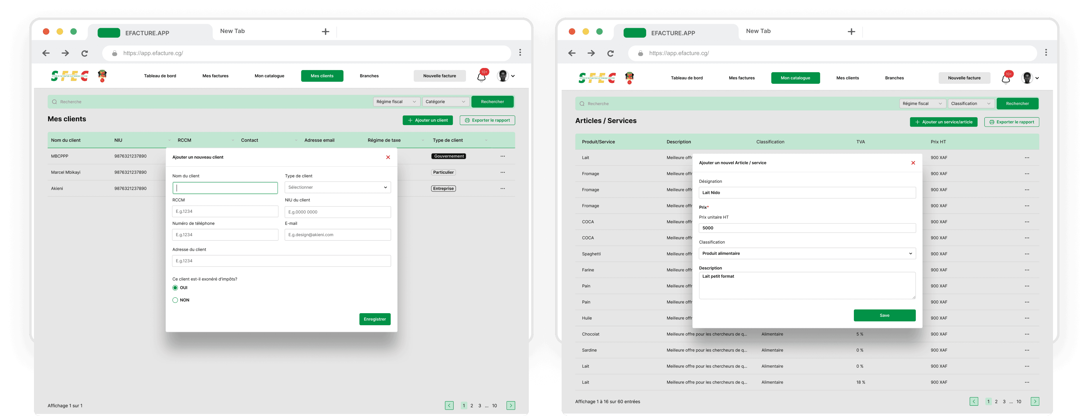
Once the team reached a consensus on the User Flow, the "rules of engagement" were locked. This gave me the green light to focus on the High-Fidelity UI Design, where we move from "how it works" to "how it looks, feels, and builds trust."
Because the backend logic—like the taxpayer lookup and password validation—was already settled, the UI phase was an exercise in pure refinement rather than guesswork.
What was achieved in this stage:
Applying the Visual Identity: Translating the "SFEC" brand into a professional interface that feels secure for taxpayers.
Executing the Logic Visually: Designing the specific input fields for NIU/RCCM and the "Successful status" screens we mapped out in the sequence.
Polishing Error States: Taking the "if/else" error triggers (like password mismatches or expired links) and turning them into clear, helpful visual feedback for the user.
Ensuring Accessibility: Refining typography and contrast to ensure every taxpayer, regardless of their device, can navigate the activation process with ease.



Conclusion: Designing at the Intersection of Logic and Leadership
This project marked a pivotal chapter in my career, serving as my first deep dive into a high-stakes, large-scale ecosystem. As the solo designer, I wasn't just responsible for the visual output; I was the primary bridge between the technical rigor of Engineering, the functional requirements of Business Analysts, and the strategic visions of Founders, Ministers, and Corporate Directors.
The Art of the "Smarter Question"
In a room filled with high-level stakeholders, I quickly learned that my most valuable asset wasn't my ability to use Figma, but my ability to communicate. Being positioned between BAs and Engineers required a specific type of diplomacy:
Strategic Inquiry: I moved beyond asking "what do you want?" to asking "why does this logic serve the user?"—helping to bridge the gap between ministerial goals and technical feasibility.
Driving Alignment: By producing technical documentation like Sequence Diagrams, I was able to validate complex system logic—such as taxpayer lookups and multi-channel notifications—with the BAs and Engineers before a single pixel was drawn.
Building Trust: Demonstrating that I understood the "under-the-hood" mechanics allowed me to gain the confidence of the leadership team, ensuring that design decisions were seen as strategic rather than subjective.
Beyond the "Beautiful UI"
One of the greatest challenges was designing for a massive, diverse audience. The platform had to be equally accessible to tech-savvy professionals and taxpayers who are entirely unfamiliar with digital government tools. This led to a core design philosophy for this project: Meaning over Aesthetics.
Usability as a Priority: I focused on creating robust, meaningful components that guided the user through high-friction steps like password policy validation and account activation.
Inclusion by Design: By stripping away unnecessary visual noise, I ensured that the interface felt intuitive and secure for users with varying levels of digital literacy.
Functional Clarity: Every error state and successful status update was mapped to ensure that no user felt "lost" in the system, regardless of their background.