Lillup
Lillup is a forward-thinking technology company dedicated to transforming how people learn, work, and grow in the digital age. By leveraging cutting-edge technologies such as artificial intelligence and blockchain, Lillup is building intelligent platforms that support skills-based talent development, career progression, and future of work solutions.
San Francisco, US
2014
Blockchain, AI
Product Design (UserFlow)
50+
Challenge
One of the main challenges at Lillup was translating complex product ideas into clear, structured, and understandable user experiences. The product vision involved multiple stakeholders, evolving requirements, and innovative concepts around skills, workforce intelligence, and digital identity which required strong alignment across teams.
My responsibility was to work closely with product managers, developers, and stakeholders to clarify ideas and transform them into coherent user flows. Many features initially lacked structure or consistency, so I conducted comprehensive flow audits to identify friction points, redundancies, and misalignments.
Results
As a result, we structured and centralized all product documentation in Confluence, creating a single source of truth for the entire team. This improved traceability, reduced ambiguity, and ensured that every feature, decision, and user flow was clearly documented and accessible.
We organized product data and redesigned multiple experience flows to create a more consistent and scalable system. This alignment between documentation, design, and development strengthened collaboration across teams and accelerated delivery.
20%
Improved onboarding process
32%
Increase in user retention
18%
Reduce frustration & questions

Storyboard & Visual Map
To ensure alignment and clarity across the team, we created a storyboard visual map that translated abstract product ideas into a structured, visual narrative. This tool allowed us to map out user journeys step by step, illustrating how users move through the experience and how different features connect within the ecosystem.


Information Architecture (IA)
Upon finalizing the storyboarding and visual mapping phases, we transitioned into Information Architecture (IA). My primary objective was to define the structural logic of the platform, ensuring that complex data sets were organized into a scalable hierarchy. By architecting how information flows through the system, I created a blueprint that prioritizes findability and ensures a seamless transition between high-level overviews and granular data details.


Brainstorming the user flow
Before defining the final structure of the product, we conducted collaborative brainstorming sessions focused on mapping and exploring user flows. The objective was to translate ideas, features, and business requirements into clear user journeys. These sessions allowed us to question assumptions, explore alternative paths, and align on the most logical and intuitive progression for users.

Building the UX Flow
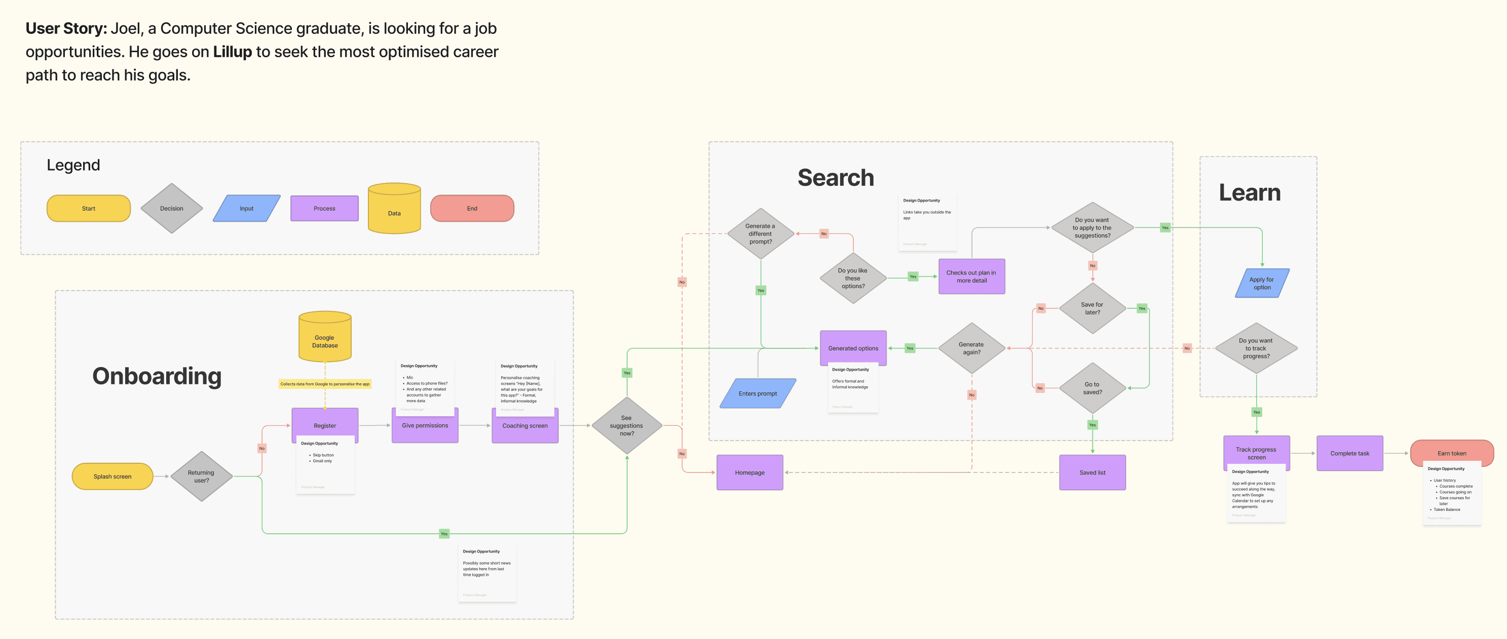


User Haptics Designing the "Feel" of the Flow
To complement the visual UI, I integrated a Haptic Feedback Layer to provide physical confirmation for key user actions. By mapping specific vibrations to the user flow such as a subtle pulse for a successful "Save" or a distinct double-tap for an error I created a multi-sensory experience that guides the user without them needing to look at the screen. This ensures that the "What to build" phase included not just pixels, but a tactile language that reinforces user confidence at every step.


Ideation and implementation UI
After finalizing the logic, We moved into the Ideation and UI phase with a mission: to translate our abstract flows into a concrete build-guide. This phase was essential for the UI/UX team to understand exactly what to build and how each screen connected. By designing with the flow in mind, We ensured that every component had a purpose, giving the UI design team a clear roadmap that eliminated guesswork and ensured the final interface remained true to our original user goals.


Conclusion
This project reinforced the value of logic-first design. By taking the lead on the User Flow Implementation, I acted as the bridge between high-level strategy and technical execution.
The result was a streamlined development process where the UI/UX team could build with total clarity, significantly reducing the need for mid-build pivots. By integrating haptics into the core logic, we created a multi-sensory journey that feels intuitive, accessible, and deeply polished. This process proved that when the foundation is solid and the implementation is detailed, the final product becomes a natural, frictionless extension of the user’s intent.